Do you remember that New York Times chart? (Yea! I found a way to mention it another time!) On the chart, you can clearly see the boom of the 70s and the boom of the 80s. Each one is followed by a period of price correction which brought back prices to the level before the boom.
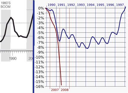 I have cut the part showing the boom of the 80s (on the left), and put it next to a much more detailed view (on the right, source: Wikipedia) that shows:
- In blue: how prices evolved in the first half of the 90s, when the bubble of the 80s deflated.
- In red: how prices evolved since mid-2006, when the current bubble started deflating.
It is stunning to see how much more brutal the current correction is. I hear some people saying: "well, during the boom of the 80s prices inflated by 20% and a correction of 15% followed; during this boom prices inflated by 100% so you have to expect a much, much more aggressive correction!"
I hope those people are wrong. But I wouldn't advise you to base your investment choices on my hopes ;).


